Light and color are some of the most powerful tools for creating mood and conveying emotions. But to work with them correctly, you need to have a certain baseline artistic knowledge. In this post, you’ll get a crash course and a path forward!

In almost any game, light is a very important element – and we’re not just talking about light that helps create realistic and beautiful graphics, but an element that actually supports the gameplay itself. Essentially, without good lighting, a game is only half ready. That said, it’s not only necessary to work with light correctly in a technical sense, we also need to understand it in terms of artistry.
Hello! My name is Alexander Sharov, and I’m a Senior Environment Artist at War Robots: Frontiers project. I’ve been working in the gaming industry for about 7 years and have experience in mobile development, VR projects, and the creation of AAA games. This article will touch upon the basics of working with light in games and it was for folks who’ve always wanted to really understand exactly why it is so important. Additionally, since color and light are closely intertwined concepts, we’ll also be discussing the former.
The importance of light when creating art in games and films
Let’s start with the basics: light can be used to portray a mood, convey the exact emotions the developers intended, and create shadows, reflections, and other effects that can also influence game mechanics. (As a quick example, in survival games, light can be used to create a sense of fear and tension whenever the player finds themselves enshrouded in darkness and cannot see what is around them.)
Light is the most powerful tool for creating important accents within a game; let's consider four examples of this, beginning with the 2018 reboot of God of War.

Here, the light helps direct the player's eye, highlight contrasts, and show the key focal point: that is, the place that a player should go as well as what awaits them there. The lighting also creates an atmosphere that evokes certain emotions and a “wow” effect.
The contrast of blue and red color shades adds more interest to the picture, and as a result the eye will switch back and forth between them. The road is also highlighted with both light and color — this allows you to quickly understand the direction of movement. The light also separates the foreground, middle and background, which allows you to better see the volume of the location and prevents objects from merging. Of course, the player doesn’t thoroughly analyze what they’re seeing – they do everything on a subconscious level.
The second example is from the latest game in the aforementioned series, God of War: Ragnarök.

In this screenshot, the atmosphere is both darker and colder. The contrast of light coming from the lantern allows the developers to create an accent that is clearly visible against the background and the rest of the surroundings. This is the easiest approach to point out to players that there is something important at a point. For example, if there were no lantern, it wouldn’t be clear that you could enter this door or need to go in this direction at all. Light here not only plays a visual role, but also helps to emphasize the gameplay. Again here let’s note also that, the eye also switches between the cooler blue and the warm shades of color.
The third and fourth screenshots are from Horizon Forbidden West and the Burning Shores add-on.


The third and forth screenshot above both follow the same fundamental rules: light creates the atmosphere, demonstrates points of interest, shows scale, direction, and so on. In this case, these effects are achieved via the contrast of cold and warm light, shapes, the tilt of objects, and other design elements. The light emphasizes and enhances all of this, conveying the ideas that were conjured up by the developers.
More specifically, in the third screenshot, we see a huge entrance illuminated with warm light; standing against the backdrop of the cold location as depicted, this light attracts the player’s eye. Further, the design of the location itself also works very well: the entrance has an unusual shape that stands out rom everything else.
In the fourth screenshot, a slanted tree with a nearby character seems to direct the player’s eye to the right side of the picture where an object of interest is located, in this case a lonely building which stands out well against everything else. The light here helps to separate the plans well, highlights the scale of the location and ensures that everything doesn’t merge into one continuous mass. The abandoned city behind the main building is specially heavily covered with fog in order to highlight it and the main character against other objects that are also present in this location.
Psychology of color
So, now that we’ve looked at light in action within some example games, how do we actually work with it? What rules should you follow in order to achieve proper, interesting results? Well, there is a science surrounding color concerned with how they affect people from a psychological point of view. These rules are also used by artists to achieve a desired effect, but with more emphasis on an artistic component, that is, to evoke specific player emotions, anger, joy, sadness, hope, and so on. Color theory explores and explains how colors are created, how they interact with each other, and how they affect people's emotions and moods.

Within game development there are many areas where color plays a key role: UI, VFX, as well as lighting, environment, and cinematic design. For example, in UI/UX, we often need some kind of indication to distinguish allies from enemies, and historically, games have marked allies as blue or green and enemies as red; this is necessary so that players can immediately distinguish friend from foe.
We can also see this in the recent Diablo IV with its health and mana bars which also have a clear red and blue division. Red was chosen for health for a reason – it’s associated with human blood and vitality. Meanwhile, mana is shown in a blue-violet hue, as this has historically come to evoke something unknown or magical.
In terms of environment design, a red hue creates tension, thereby preparing the player for active actions or perhaps instilling a sense of fear. Shades of yellow often highlight objects that can be interacted with and make them easy to notice within an environment.
Several frames of the same scene can be illuminated completely differently, and this is applicable when talking about games, movies, animation, and art in general. At one point, everything can be red and purple, thus creating an atmosphere of tension and mistrust. At another point, the color may be green or blue, showing a calm and relaxing atmosphere.

Composition, tone, color
So, light is a fundamental element in framing and composition, be it within a game or a film. But this element will only work if you take into account some artistic rules: lines, shapes, perspective, tone, color theory. Studying the theory and applying it when configuring the light will make the game more expressive and interesting.
Let's look at the basics that are useful to know, starting with composition.

Perhaps the most popular compositional technique you may have heard about is the rule of thirds. This is a classic rule of composition, widely used, and which states that the most interesting and important parts of the frame that you want to display should be located at the intersection of some imaginary lines within this frame, illustrated in the top-right of the image above.
It’s important to remember that this isn’t an absolute rule, but rather a guide and a convenient template that allows you to hone in on what is important. Below are a few pictures that show how composition (namely the use of focal points and the division of the frame into components and lines) can work and place emphasis on the most important elements or actions at a particular moment in time.
By neglecting the study of composition or failing to adhere to certain rules for constructing a frame, it’s likely the information you want to convey will be lost. So, it’s important to continuously review the artistic fundamentals; and a lot of aspects in 3D come from classical painting, illustration, and filmmaking.
The use of some compositional techniques won’t automatically make a picture and scene super interesting and inspiring, but it will allow you to get closer to it.
Let’s look at some examples from film which demonstrate how the composition and staging of a shot work to convey a director’s idea; the use of focal points and the division of the frame into components and lines can help place emphasis on the most important elements or actions at a particular moment in time.


Now let's look at how composition can be applied in games; for example, consider a location from God of War Ragnarök.


In my opinion, the “Golden Triangles” rule fits well here; the artists were probably guided by other rules as well, but I will only analyze this specific method. For convenience, I’ve highlighted the relevant lines in green.
Imagine a case where a player has found themselves in a previously unknown location and now they need to quickly find their way forward. We don’t want to confuse them, we simply want them to understand where to go next and while avoiding any chance of boredom during the journey. The composition in the image above is a good example of how artists can arrange elements in this area so that everything is clear and the most important information is in the most visible places.
So, obviously, the hero will have to go through a large gate, located diagonally ahead, and there is a staircase that leads down located on the left side of the frame. The road is highlighted and leads to the door. The objects are located mostly on the sides, which creates a kind of passage that makes you intuitively want to proceed directly forward.
Meanwhile, moonlight places emphasis on the door so that it is the brightest spot in the location. Since the rest of the room is in shadow, this contrast creates a subconscious desire to look at the door. Two lamps are placed in the front foreground to show the contrast of light and shadow and this also works to grab the player's attention. The most interesting thing here is that the foliage and vines have been specifically made with a bright red hue, so that unlike the moonlight and green vegetation, they attract maximum attention. The mountains located behind suggest that beyond the door there is a large space that either needs to be explored or serves as a kind of visual landscape.
All of these things: the composition, lighting, color, navigation, and the object placement are designed to help the player and tell a story. (Of course, there are unique considerations when it comes to working with single-player and multiplayer games, but the basic approach is the same everywhere.)
In this example, we looked at one specific frame from one angle. But the character can move and look around, so how to handle this? Developers should choose several main angles that are important from the gameplay point of view. These will serve as a foundation while the rest will be finalized during development. That is, the developers must think through how the player will come into a location, how they leave it, and the key things they should see, based on the gameplay, and a huge range of specialists are involved in this endeavor: concept artists, lighting artists, environment artists, and so on.
After we have mastered the basics of composition, it’s worth paying attention to another important aspect of working with light and color: tonality.
Tonality is a basic tool for separating planes within illustrations, games, and films. Without tone, everything will merge into one plane, and it will be difficult to discern the main idea of a frame. There are several well-known techniques that help make frames easier to parse: zebra lighting, contrasts, and breaking the frame into planes.
Zebra lighting is the alternation of bright and dark spaces, and due to these differences, attention is attracted. This technique allows you to highlight the character and place emphasis on them. Below, the silhouette of the character is clearly visible against a background of white light, and vice versa.

Another important technique working with contrast and tones. It’s important to remember that in terms of perception, tone is always more important than color. It’s tone that primarily creates volume and visually divides a picture.
Take a look at the example below: adding color to the first image without working with the color tone or intensity doesn't make much of a difference – the image still feels flat, with its parts blending into one. Yet if we play with the tone, even a black and white drawing stands out, and a clear contrast appears; it becomes immediately clear how parts of the image interact with each other.

Another good technique to help separate parts of the image is dividing the frame into planes. By using this approach, the player (or any other viewer) will be able to more clearly distinguish objects from each other.
Let's take a look at the picture of wolves below: it shows animals grouped by brightness and tones depending on how close they are to the observer. If this division didn’t exist, it would be very difficult to discern a wolf sitting just in front of the “camera” from one sitting farther away.

A tone key is also a useful tool to consider. This is a kind of guide that gives information about the range a picture, frame, illustration will be depicted in. This tool is especially helpful when working with lighting in games, allowing you to achieve the desired atmosphere at the right moment in the story.
A tone key is selected based on the overall art direction of the project and the description of the task for the location:
— What is the location?
— What does it need to depict?
— What atmosphere should it convey?
— What emotions should it evoke?
A higher color key can create an atmosphere of calmness and hope, while a lower one conveys an atmosphere of tension, intrigue, danger.

Below are a few examples from concept artist sketches which contain both a high key and a low key. The high key is visible in the picture where light colors predominate and the low key is demonstrated in the picture with predominantly dark tones.

Types of color combinations
Now let's talk a little about color, a truly vast topic that is studied by several separate sciences. In light of this, let's look at the very basics of color which will be useful to all beginners.
Color has several components, which in different combinations, produce different effects.

Hue is essentially a base color; Saturation is the intensity or purity of color and Lightness (Value) is the darkness or brightness of a color, which determines its shape and depth.
In any frame or illustration (if we’re talking about professional work), color combinations are selected for a reason, based on certain principles, according to the color wheel. This concept dates back to the 19th century and was first mentioned by the Swiss artist Johannes Itten in his book “The Art of Color”.
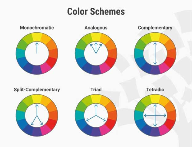
According to this theory, there are different sets of colors that always go well together and these colors can be identified by using a special color wheel. In fact, there are a variety of combinations: complementary colors are on the opposite sides of the circle; for a monochromatic palette, one color is taken and varied in tones; analogous colors go one after another in the color wheel.
Let’s look at some examples of each of these.

Here we see complementary colors; within the color wheel, red and orange are the opposite colors of green and light green, and this contrast attracts attention.

Above we see complementary colors and we observe the contrast in light itself – the warm light from the lanterns and the cold moonlight that shines throughout the entire location.

In the above image from Firewatch, we see analogous colors being used to help create a warm atmosphere; at the same time, the selection of brightness and tone provide the desired accents.

In the illustration above we have split-complementary colors; we can see a distinct blue hair color and several colors from the opposite side of the color wheel, like yellow and burgundy.
The methods shown above are needed in order to attract attention in the frame through accents. All methods are chosen at the discretion of the artist; and there are no clear and obvious boundaries – the important thing is how successfully the player or viewer understands the idea you intend to convey.
The target audience
Another important aspect when working with light is understanding the target audience, and this will determine how you’ll need to approach the work. This can be roughly divided into two types: realism and stylization. (Naturally this is conditional and greatly depends on the project, art direction, and the intended audience)
In terms of the volume of work, realism is always more difficult to create, since the task is to convey the picture as close as possible to the real world: realistic light, materials, effects, and so on. Technically speaking, you also need to keep in mind that the game is not pre-recorded, unlike a film, it runs in real time so accordingly, large resources are required to process the image. And there is no way to cut corners: if you mess something up, the audience will instantly notice.
Stylization is more simplified, with an emphasis on accent colors and simplified shapes.
Of course, there are no restrictions in terms of creativity: you can mix and match styles, it all depends on the overall art direction of the project.
If we’re talking specifically about light and color, realism is characterized by more neutral-cold shades, without pronounced accents. For example, here are images from the movie “Dunkirk” and the game Call of Duty: WWII.


With stylization, we work with a completely different approach, using bright colors with accents to attract as much attention as possible and to smooth out the conventions of the game.
Here are a couple of pictures from Fortnite and Overwatch; in the real world we don’t see colors or lighting like this, but when something is stylized, the audience doesn’t criticize this discrepancy, and everything appears harmonious.

***
Light and color, both in games and in films, are one of the most powerful tools for creating mood and conveying emotions. But to work with it correctly, you need to have a certain baseline artistic knowledge. You also need to play and analyze different games and, if possible, read specialized literature — you can start with “Color and Light” by James Gurney. All this will help greatly improve your skills, and the rest is a matter of putting theory into continuous practice!


